bureaubrandl❋
bureaubrandl❋
bureaubrandl❋
bureaubrandl❋
Complete web solutions, from conception to design and development.
Allround support from the initial idea and necessary content to launch and beyond.
Allround support from the initial idea and necessary content to launch and beyond.
services
webdesign
functional, accessible, user-friendly, mobile-first
search engine optimisation
visibility, organic traffic, higher search rankings
support & consultation
updates, 24/7 customer support, adjustments
webflow development
high performing, responsive, cms-integration
projects
PAZ

category
❋ artist portfolio
service
❋ Custom design tailored to Paz
❋ Optimization of text and images
❋ animations
❋ Web development
For PAZ's artist portfolio, bureaubrandl developed a concept built around two distinct layers. The homepage carries a hand-drawn, visual language with floating objects against an open sky, each representing one of his three categories. The gallery pages are the opposite: clean, minimal, fully focused on the work. A deliberate contrast that reflects PAZ's character while keeping the gallery experience distraction-free.
credits
❋ whole project by bureaubrandl
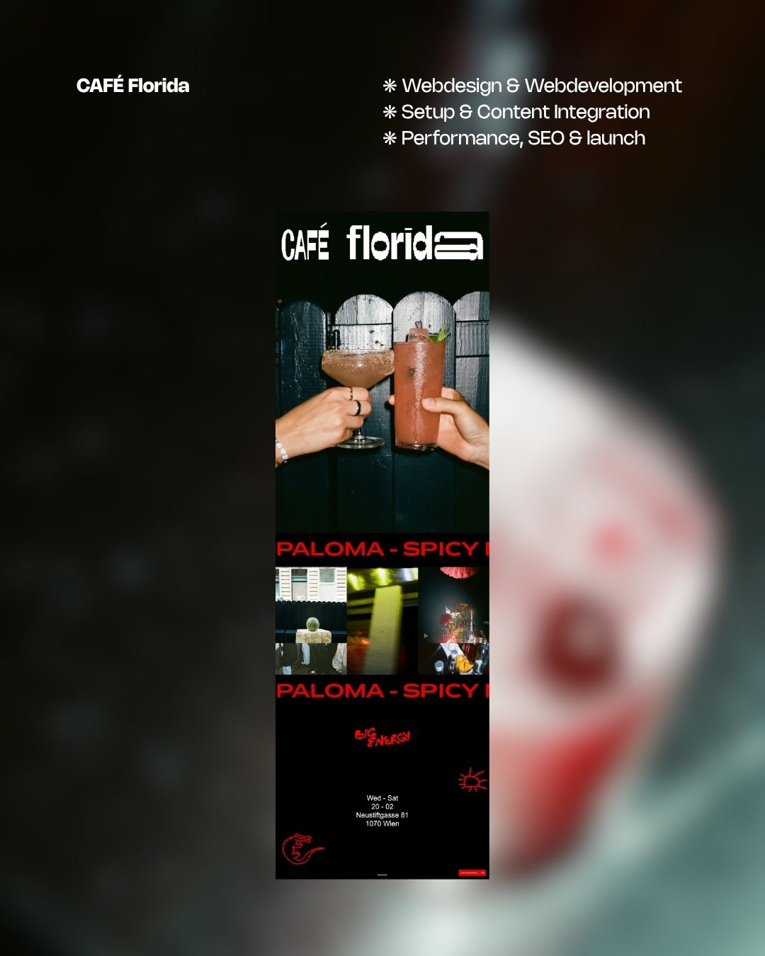
CAFÉ florida

category
❋ gastronomy
service
❋ design concept
❋ setup & content integration
❋ reservation tool Integration
For CAFÉ Florida, bureaubrandl translated the bar's character directly into the design. The site is dark, high contrast, with strong red as the only accent, mirroring the neon lit interior. The menu runs across two fast moving ticker bands, giving visitors just enough of a glimpse to get curious, but never the full picture. The same logic applies to the photo section, where images cycle through quickly rather than sitting still. Just like the bar itself, which has no sign outside and no invitation to enter, the site reveals nothing completely. You have to show up to find out.
credits
❋ whole project by bureaubrandl
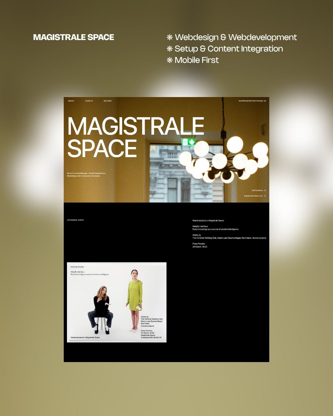
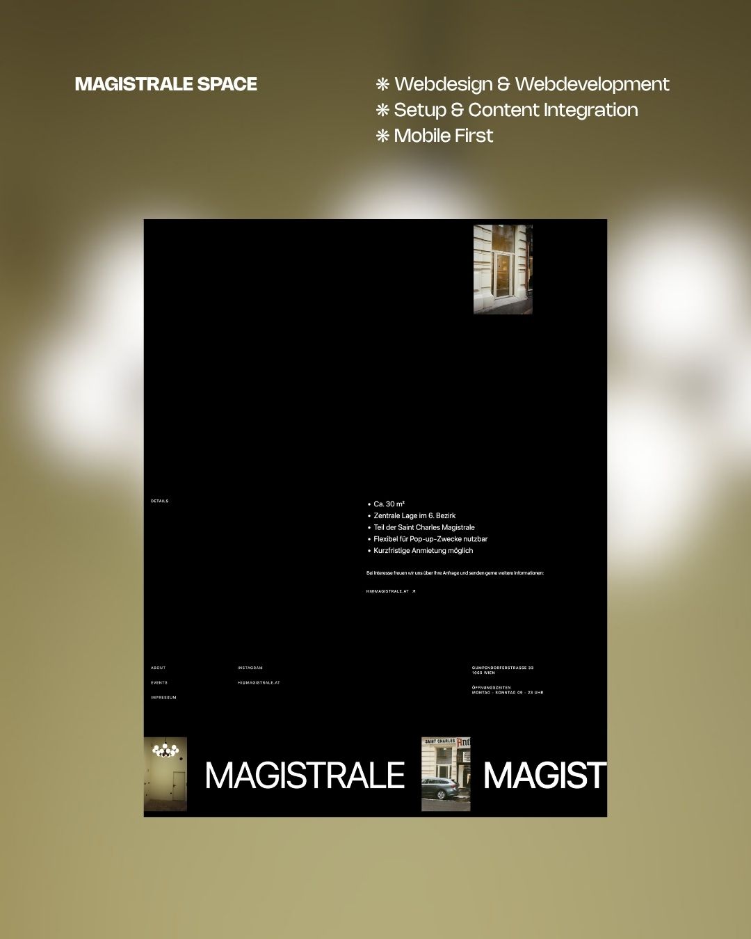
magistrale space
category
❋ art space
service
❋ Design Concept
❋ content integration
❋ animations
❋ web development
For Magistrale Space, bureaubrandl built a site as straightforward as the space itself. A flexible pop-up venue in the heart of Vienna's 6th district, rotating exhibitions, brand experiences and temporary concepts, needed a web presence that communicates quickly and gets out of the way. Current and past events are front and centre, the space details are clear, and booking is one click away. Minimal by design, functional by intent.
credits
❋ whole project by bureaubrandl
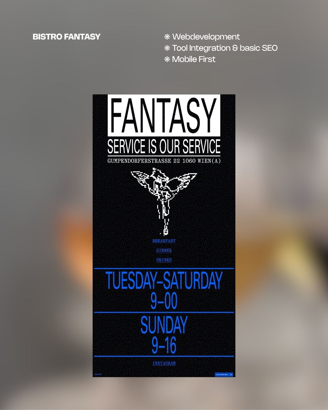
BISTRO FANTASY
category
❋ gastronomy
service
❋ Webdevelopment
❋ setup & content integration
❋ Performance, SEO & launch
For Bistro Fantasy, bureaubrandl collaborated with Studio Johannes Bissinger, who delivered the design and corporate identity. bureaubrandl handled the development and integrated a reservation tool, translating the visual identity into a tight, functional one pager. Menu access, opening times and booking in one place, nothing more than needed.
credits
❋ CD & Webdesign by Studio Johannes Bissinger
❋ Webdevelopment by bureaubrandl
inner.spaces
category
❋ architecture & coaching
service
❋ web development
❋ animations
❋ content optimization and integration
❋ CMS integration
❋ setup, SEO & launch
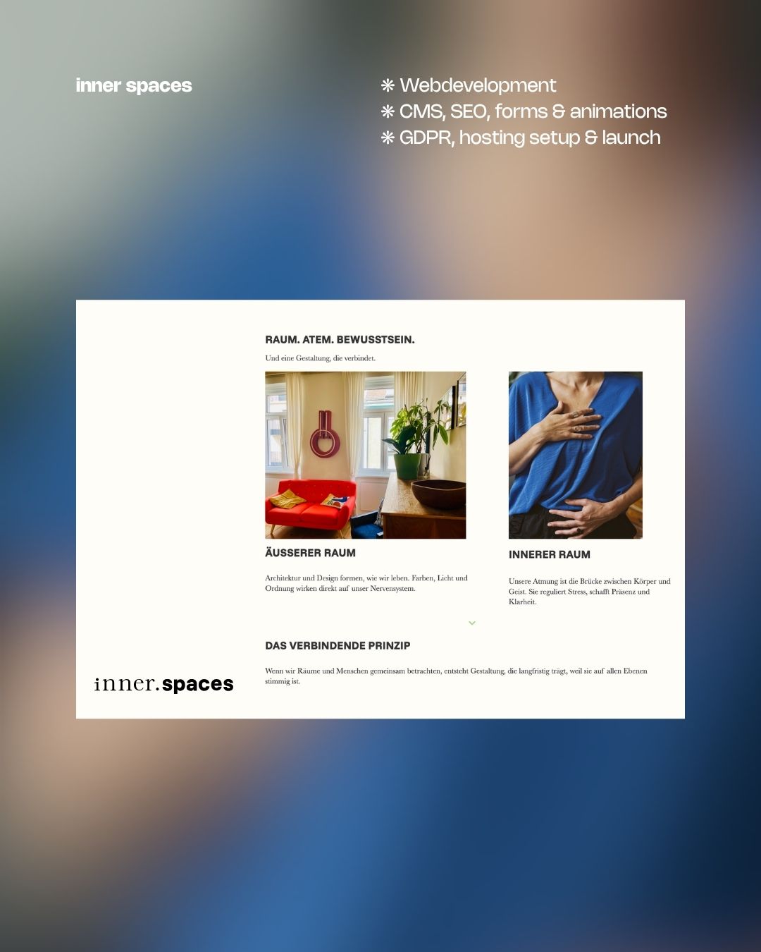
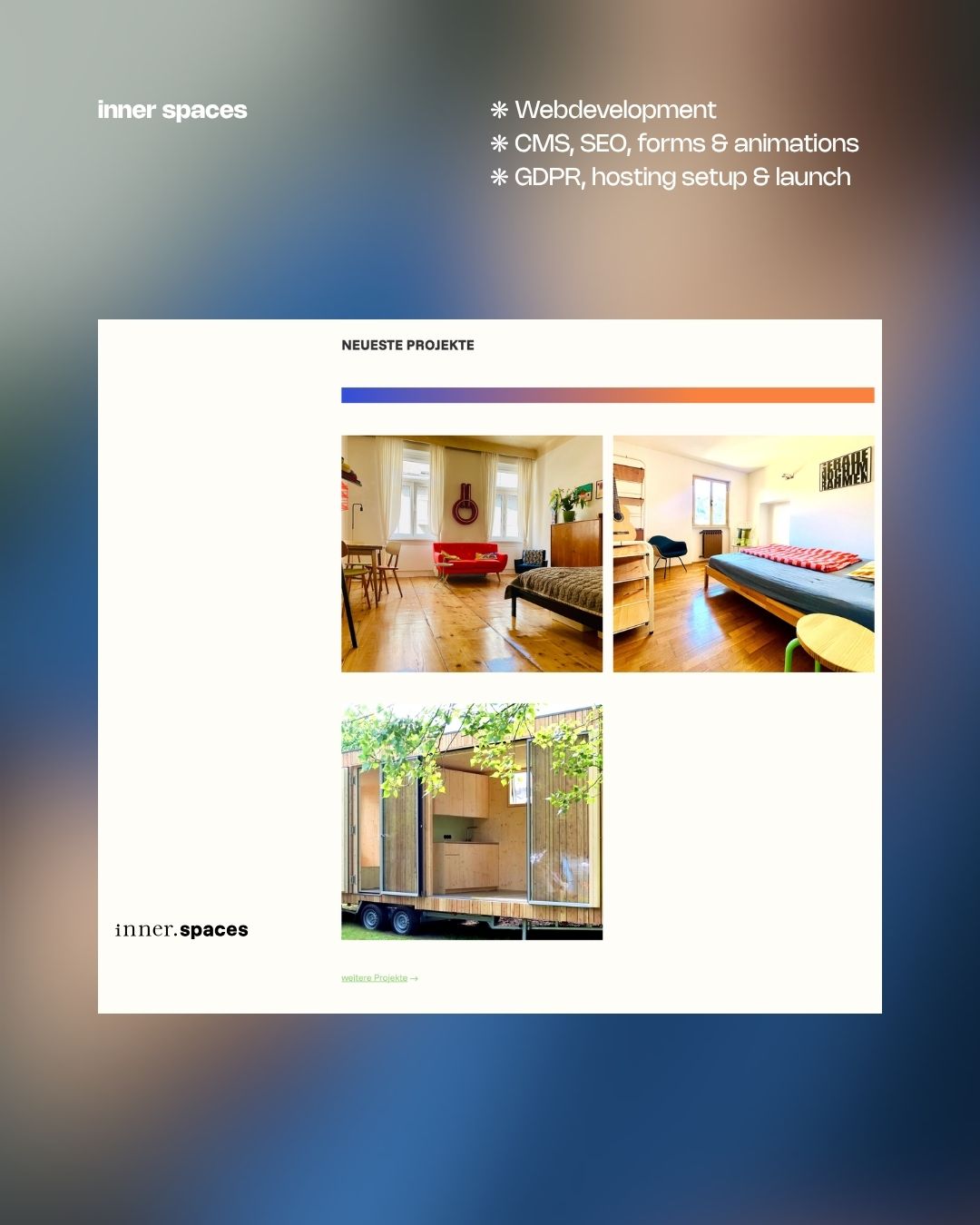
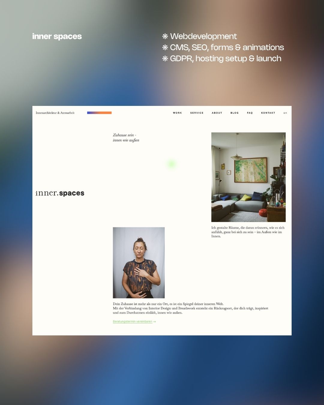
For inner.spaces, bureaubrandl collaborated with Studio Green Velvet, who developed the corporate identity and initial design direction. Both studios worked together to finalise the visual concept, with bureaubrandl taking on the web development and animation. The site reflects the dual nature of the practice, interior design and breathwork, through calm pacing, breath driven animations and a layout that feels considered rather than busy.
credits
❋ CD & Webdesign by Studiogreenvelvet
❋ webdesign & Webdevelopment by bureaubrandl
Phil Wolf

category
❋ artist portfolio
service
❋ design concept with navigational focus
❋ setup & content integration
❋ web development
For Phil Wolf's artist portfolio, bureaubrandl developed a concept centred entirely around the work. With a body of paintings ranging from small format to large scale canvases, the structure and layout needed to give each piece the space it deserves. The site organises his work across paintings, exhibitions, and literature, keeping navigation clear and the visual experience uninterrupted. The design steps back so the paintings can come forward.
credits
❋ whole project by bureaubrandl
FRGbR

category
❋ architecture office
service
❋ minimalistic design concept
❋ content integration
❋ web development
For FRGbR, bureaubrandl made a deliberate choice to say nothing more than necessary. Name, address, contact. Black background, centred, nothing else. For an architecture and engineering office, the absence of anything superfluous is a statement in itself. The site does exactly what it needs to do and stops there.
credits
❋ whole project by bureaubrandl
Swetlana Gerner

category
❋ artist portfolio
service
❋ design concept with gallery focus
❋ content optimization & integration
❋ web development
For Swetlana Gerner's artist portfolio, bureaubrandl developed a structure built around the way she actually works. Her practice is organised in distinct thematic series, so the navigation puts those series front and centre rather than presenting an undifferentiated archive of images. Each theme leads into its own collection of works, giving visitors a clear entry point into her practice and the context to understand it.
credits
❋ whole project by bureaubrandl
AEREA
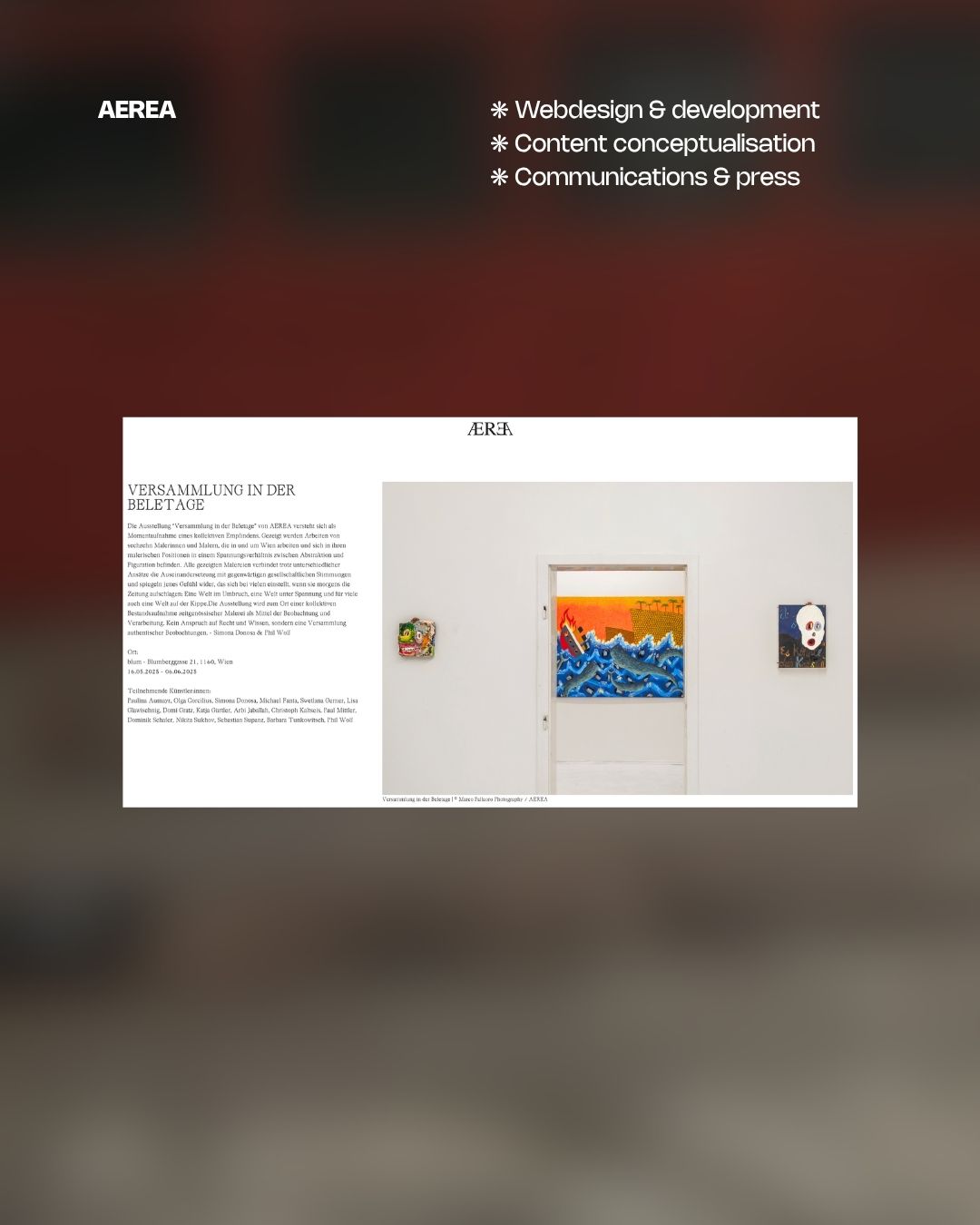
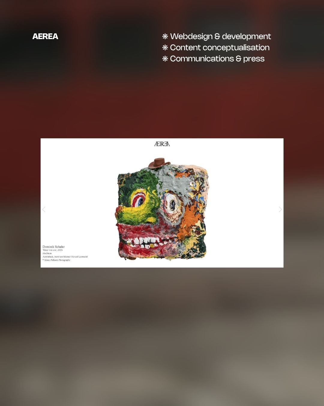
category
❋ art collective
service
❋ design concept with navigation focus
❋ content optimization & integration
❋ web development
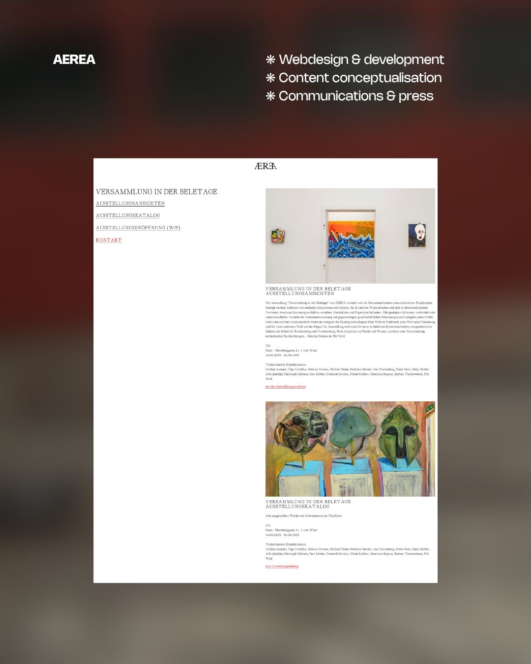
For AEREA, bureaubrandl built the site around the collective's need for a reliable, growing archive. Exhibitions and interventions are organised strictly chronologically, giving visitors a clear overview of the collective's activity over time. Each entry opens into its own gallery, designed to give a quick but comprehensive visual impression of the respective show.
credits
❋ whole project by bureaubrandl
Paulina Aumayr
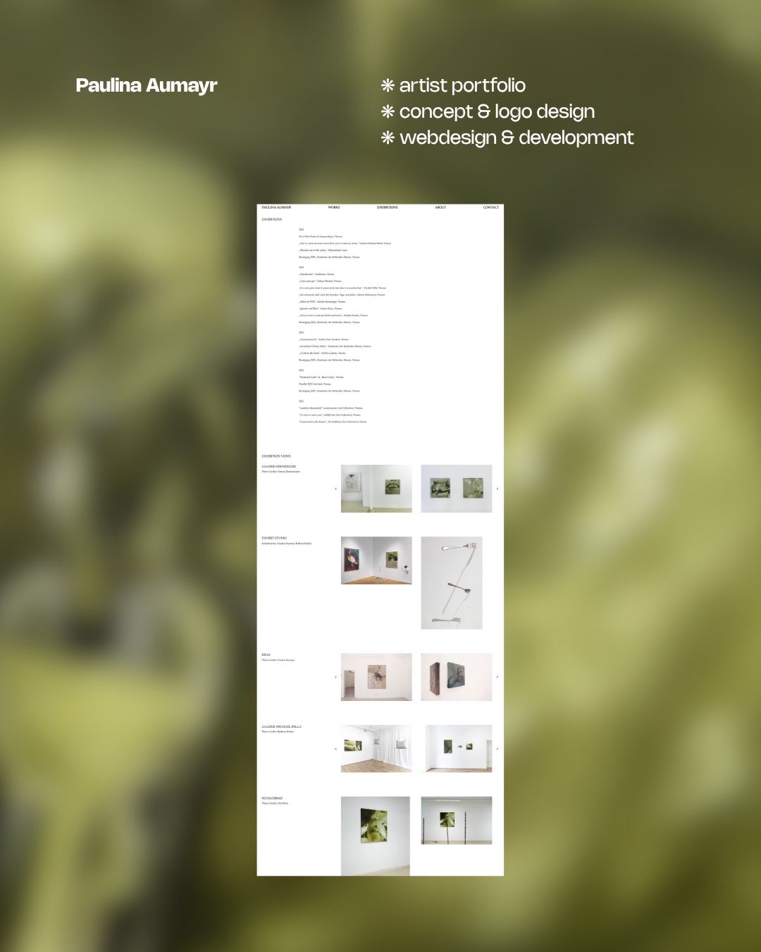
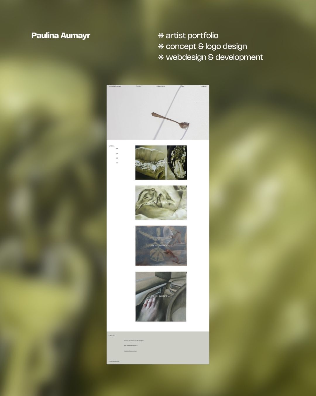
category
❋ artist portfolio
service
❋ design concept with gallery focus
❋ content optimization & integration
❋ webdevelopment
For Paulina Aumayr's artist portfolio, bureaubrandl structured the site around the chronological logic of her practice. Works are organised by year, making her development as a painter legible at a glance. The homepage offers a preview of each phase, with dedicated year pages behind for anyone wanting to move through her archive in depth. Navigation through a large and growing body of work, kept clear and uncluttered.
credits
❋ whole project by bureaubrandl
bynand

category
❋ tech startup
service
❋ design concept
❋ content integration
❋ web development
❋ Performance, SEO & launch
For bynand, bureaubrandl built a landing page for a German automotive startup connecting car owners with the right workshops. The service needed to feel approachable and frictionless, so the site focuses on communicating the concept quickly and getting visitors to reach out. Clear structure, direct copy, and a straightforward path to contact. Nothing that gets in the way of the conversion.
credits
❋ whole project by bureaubrandl
Super Sups

category
❋ wellness
service
❋ e-commerce design concept
❋ content integration
❋ web development
For Super Sups, bureaubrandl built a full e-commerce experience for a Vienna based supplement brand. The site covers the complete shopping flow, from product categories across immunity, energy, and detox to individual product pages and checkout. Clean layout, clear product structure, and a setup ready to scale as the range grows. (case study)
credits
❋ whole project by bureaubrandl
pricing
landing page
~ 14 days
1400€
multi page website
~ 30 days
3200€
webshop
~ 30 days +
4000€ +
support & maintenance
hourly
120€
workflow
non binding initial meeting
via video call or in person: lets us discuss your project, goals, and ideas. I’ll share insights and possible approaches to see if we’re the right fit before any commitments.
research & feedback
ensuring the perfect design fit: thorough research shapes the concept, while regular check-ins with you keep everything on track and aligned.
conceptualization
defining the project's core: translating ideas into a clear structure, aligning design, functionality, and brand identity.
webflow development
turning the design into a fully functional, responsive, and high performing website: built for smooth editing and scalability.
settings, seo, launch
setting up forms, payment systems, and analytics while ensuring a solid SEO foundation.
contact
brandl@bureaubrandl.eu
instagram
linkedin
facebook